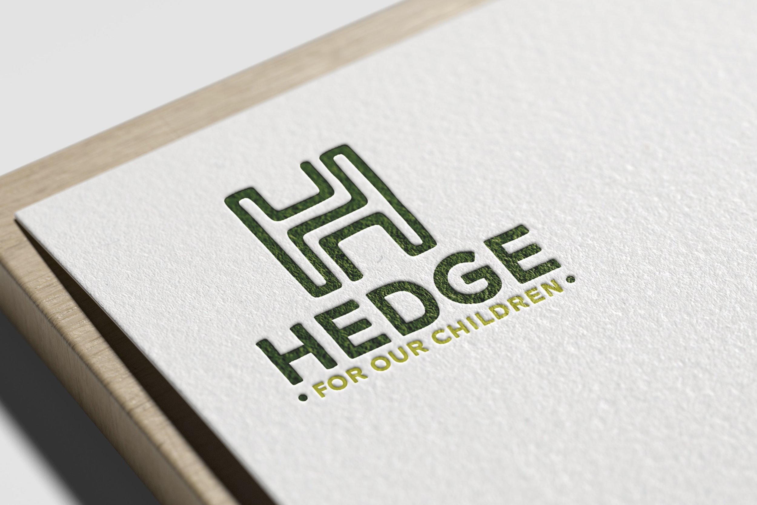
HEDGE FOR OUR CHILDREN
Logo Design // Brand Identity
Hedge For Our Children is a non-profit organization that is passionate about foster children and helping them manage their hedge funds. They protect children and give them information on their rights.
The task was to create a logo concept that was creative, inviting, yet professional. The package included a primary logotype, a seal of approval, a logomark and logo lockup.The green tone color palette is a creative play off of the word “Hedge” and it’s double meaning.
TONE WORDS
Trustworthy
Monetary
Natural
Organic
DELIVERABLES
Logo Design
Brand Identity
Supporting Elements
TARGET AUDIENCE
All Genders
Ages 18-30
Sage Archetype
Wing Innocent Archetype


